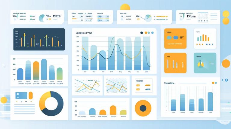
Transforming Raw Data into Actionable Insights with Power BI Dashboards
Project Details
Develops interactive dashboards from raw data, transforming complex information into clear, actionable visual insights for improved decision-making.
Skills
Tools
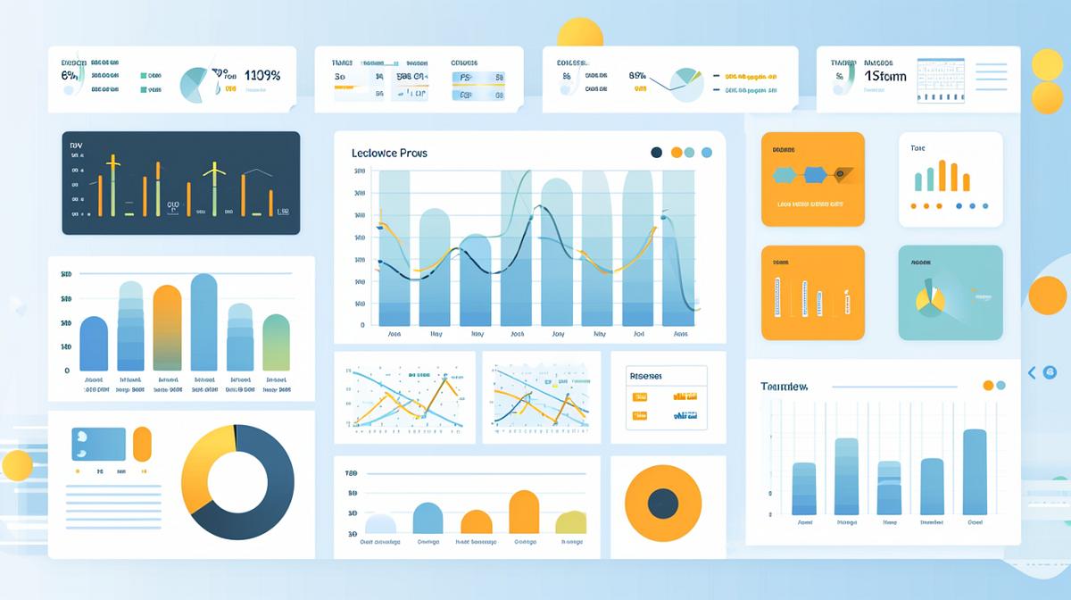
Transforming Raw Data into Actionable Insights with Power BI Dashboards
Project Overview
This project centers on the crucial task of transforming raw, often unwieldy, datasets into dynamic and easily digestible visual insights. My role as a Data Analyst is to bridge the gap between complex data and clear understanding, enabling stakeholders to make informed, data-driven decisions with confidence. The core of this initiative involves building an interactive dashboard that serves as a centralized hub for key performance metrics, trends, and patterns. This approach moves beyond static reports and tables, offering a much more intuitive and efficient way to engage with data.
The modern business landscape is awash with data, but its true value is only unlocked when it can be readily interpreted and acted upon. Without effective visualization, even the most comprehensive datasets can remain opaque, leading to missed opportunities and suboptimal strategic choices. This project directly addresses this challenge by leveraging the power of Power BI and its robust data analysis and visualization .
Problem Identification
The primary issues identified were:
- Lack of Visual Representation: Raw data, typically presented in tables or spreadsheets, was difficult to interpret and understand the underlying stories it held.
- No Clear Metric Tracking: There was no at-a-glance method to monitor key performance indicators (KPIs), making it hard to gauge current status or progress.
- Limited Decision-Making Tools: The absence of interactive or visual tools hindered effective data exploration and, consequently, robust decision-making.
- Difficulty in Trend and Pattern Identification: Spotting trends, outliers, and significant patterns within large datasets was a time-consuming and often imprecise manual process.
- Time-Consuming Analysis: The manual effort required to extract insights from raw data made the analysis process inefficient and slow.
- Fragmented Information View: Insights were scattered across different reports or tables, preventing a holistic view of the data landscape.
- Ineffective Communication of Insights: Presenting complex findings solely through tables and text made it challenging to communicate them effectively to a broad audience.
These challenges collectively pointed to a significant need for a more streamlined, visual, and accessible approach to data analysis and reporting.
Project Goals
The objectives for this project were meticulously defined to address the identified problems:
- Develop a Visual Dashboard: To create an intuitive dashboard that transforms raw data into clear, meaningful visual insights, thereby enhancing data understanding.
- Track Key Metrics: To establish a system for monitoring crucial metrics such as sales performance, growth trends, and other relevant business indicators.
- Identify Patterns and Trends: To utilize charts and graphs effectively to pinpoint underlying patterns and emerging trends within the data.
- Improve Decision-Making Capabilities: To empower stakeholders with data visualizations that facilitate faster, more accurate, and more confident decision-making.
- Present Insights Professionally: To package and present analytical findings in a polished and professional dashboard format that is easy to navigate and understand.
Each goal was designed to contribute directly to the overarching aim of making data more accessible, understandable, and actionable.
Project Impact
The successful execution of this project is projected to yield several significant benefits:
- Enhanced Visibility of Key Metrics and Trends: Stakeholders will have immediate access to a clear overview of critical business metrics and their trajectories, enabling proactive management.
- Simplified Data Comprehension: Complex datasets will be translated into easily understandable visual formats, democratizing access to insights across different technical proficiencies.
- Accelerated Identification of Patterns and Insights: The interactive nature of the dashboard will allow users to quickly uncover trends, anomalies, and opportunities that might otherwise be overlooked.
- Faster and Better Decision-Making: With readily available, clear visual data, decision-making processes will become more agile and evidence-based, leading to improved outcomes.
- Conversion of Raw Data into Actionable Business Insights: The project will ensure that data is not just presented, but is actively used to drive strategic actions and business improvements.
- Demonstrated Practical Skills in Power BI Data Visualization: The project serves as a tangible demonstration of proficiency in applying for real-world data analysis and visualization tasks.
- Improved Data Communication: The professional dashboard format will significantly enhance the ability to communicate complex data insights clearly and effectively to diverse audiences, fostering better alignment and collaboration.
Ultimately, this project aims to foster a more data-literate environment where insights are readily available, easily understood, and consistently leveraged to drive business success.
